Collision Partners

Home Page Design Review

The new Collision Partners home page, shown as a set of design directions in one place. The content is identical across every concept, so the only thing changing is the look and feel. Click Open on any concept to view it full-screen and leave feedback right on the page. Staging only, not indexed.
01 · The Concepts

CP Design Drafts - Design Feedback

For this round, focus on the design aesthetic: layout, typography, color, and overall feel. That is what we are reviewing. The copy and content are still being finalized and will follow, so there is no need to focus on the wording yet.

Grouped by direction. Every card opens the full, scrollable page. Use the Feedbucket tab on each to mark up exactly what you like and what you'd change.

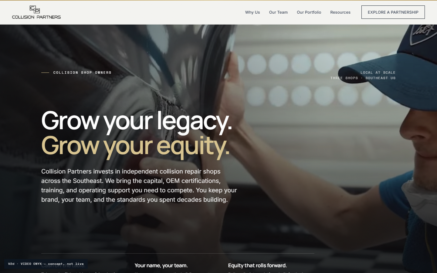
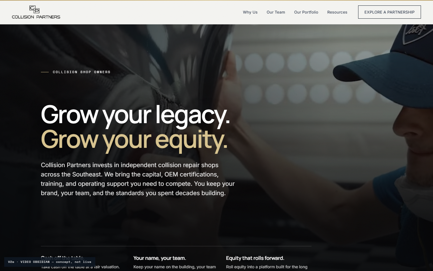
Full-Bleed Video Hero Overlay options
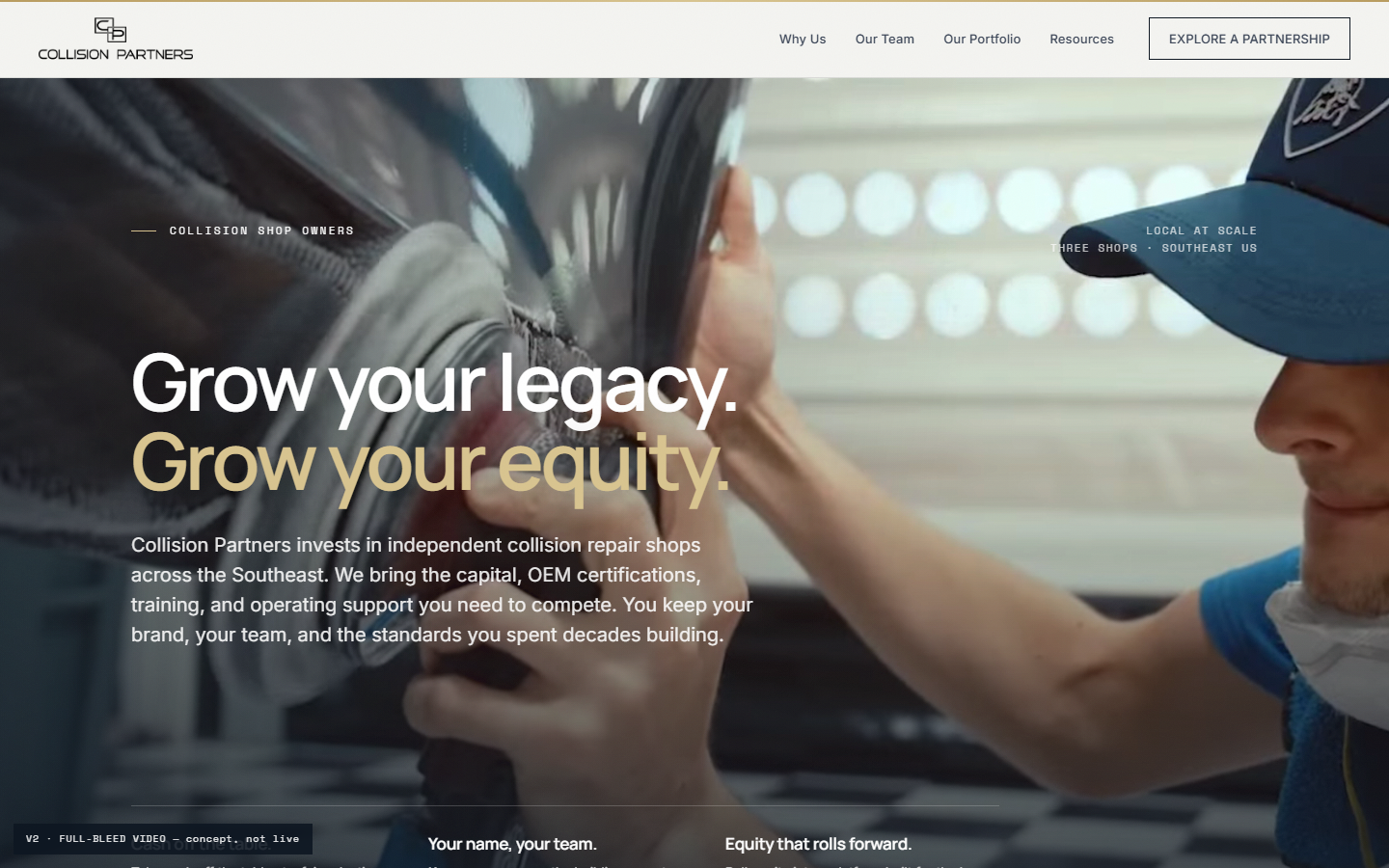
The shop footage running full-bleed behind the headline, shown with a range of overlay treatments from the cinematic navy through to the deepest obsidian, over the same content and layout below the fold.

The overlay is fully open. Treat these as a starting range, not the only options. We can set the scrim to any hue and any level of transparency: warmer, cooler, lighter, or darker, whatever reads best over the footage.

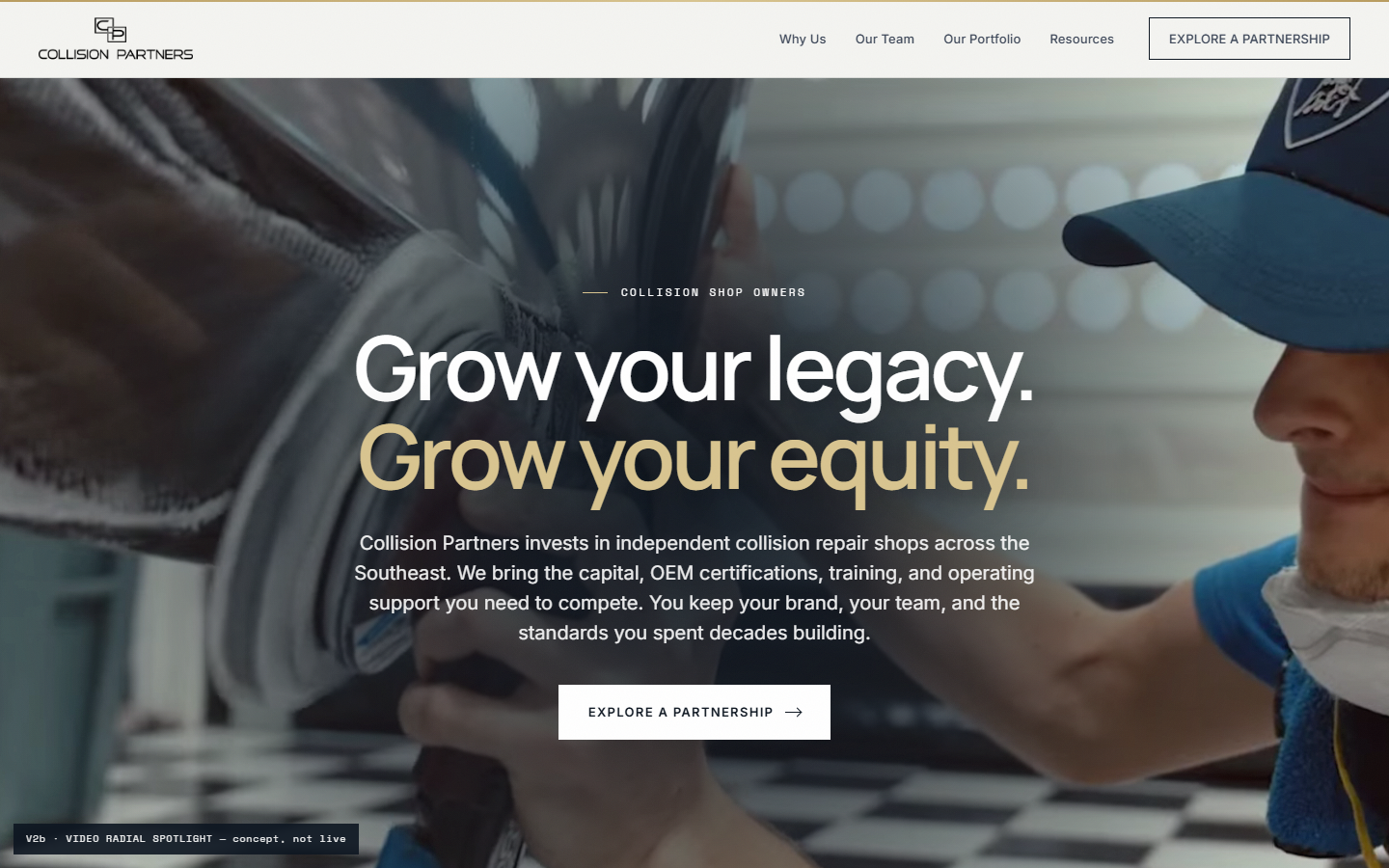
One thing to weigh: centered vs. left-aligned hero text. The Spotlight option centers the copy; the others sit it to the left. It changes the whole feel of the fold, so see which you prefer.

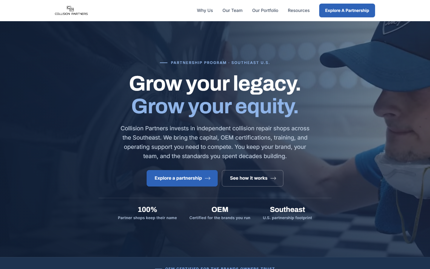
Navy Marquee A different direction
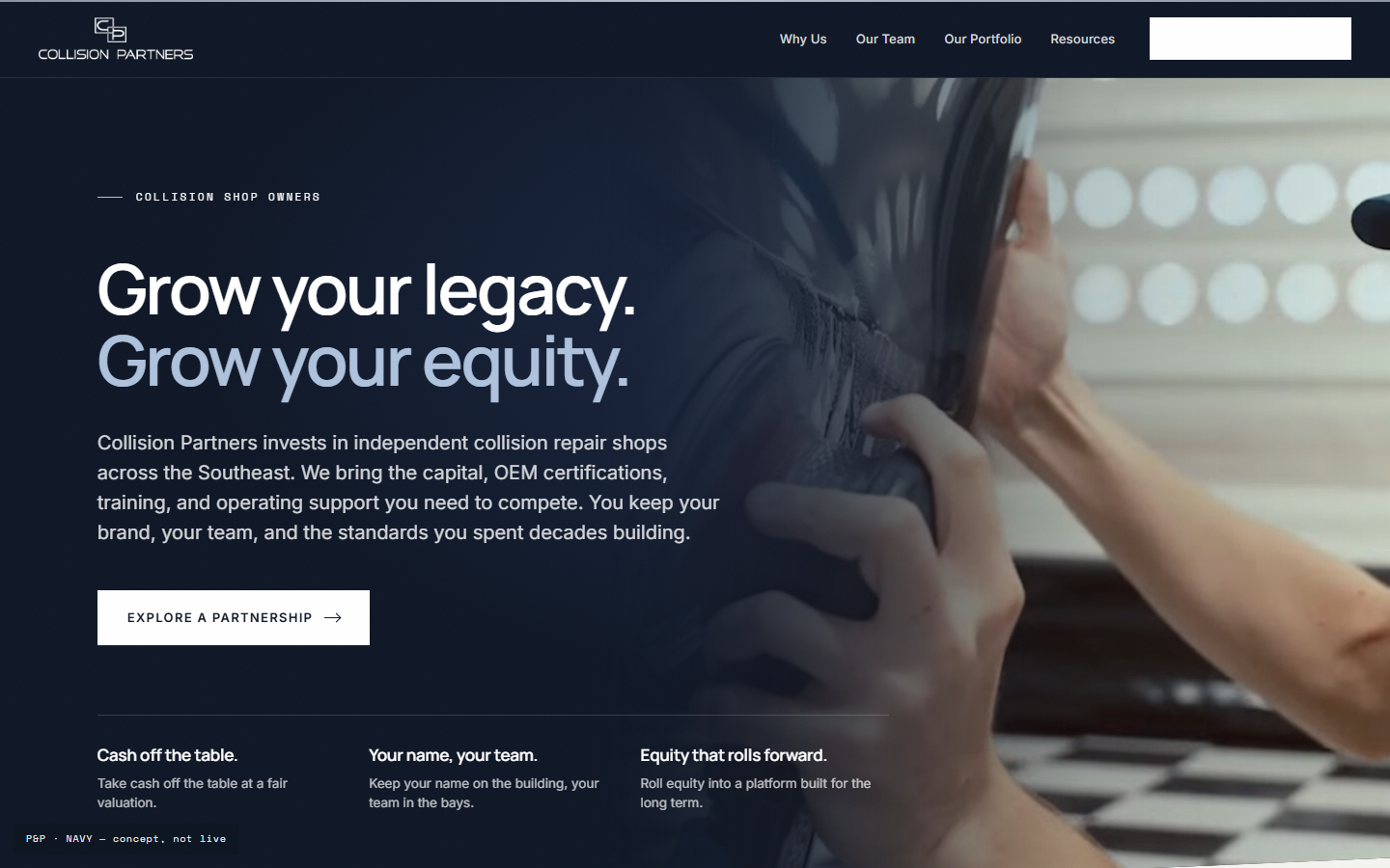
A cleaner, brighter, more corporate navy take, with the OEM brands crawling across a live marquee under the hero instead of a static logo wall.
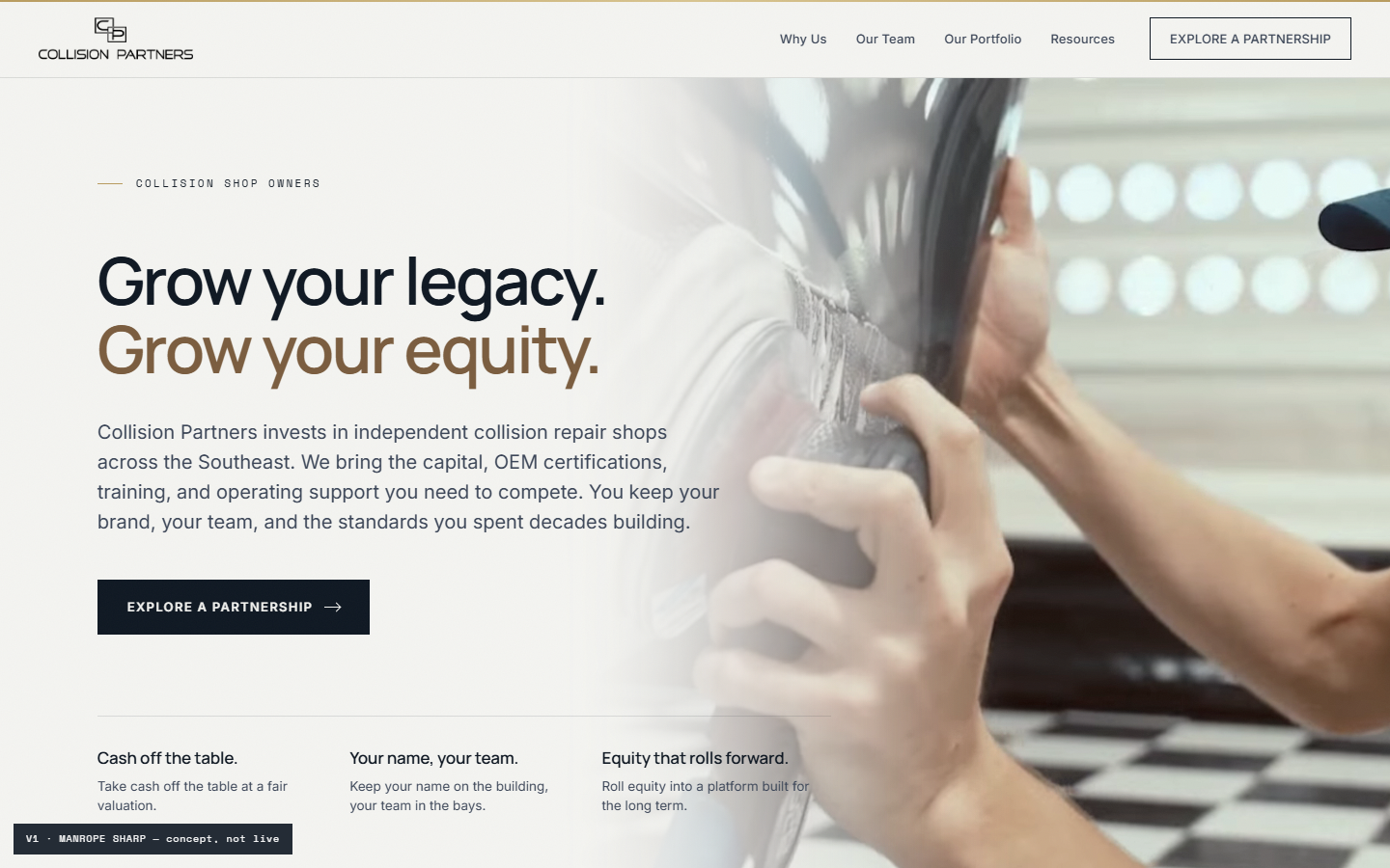
Precision & Polish
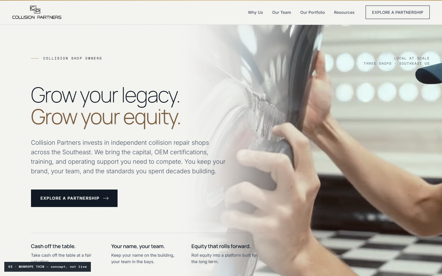
The architectural direction the team landed on: the signature paper and gold, shown in a confident weight and the original lighter weight, plus a dark navy treatment in the Chassis Master style.
02 · The Story We're Telling

The home page, top to bottom

Every concept tells the same story in the same order. It's built around the shop owner, not the platform, so the decision to partner feels clear and low-pressure. Here's the arc.

1

The owner is the hero

The page speaks to the independent shop owner weighing the next chapter, not to Collision Partners. It opens with what is in it for them.

Hero"Preserving your legacy and elevating the collision repair industry."

2

The right partner

Instead of leading with a villain, the page leads with the difference: what CP protects and what it adds. Your name stays, CP invests, and owners join as partners, not sellers.

Differentiators"Protects what you built, then makes it bigger."

3

Understood, not sold

A single line of empathy sets up the trust the rest of the page earns.

Empathy"A partner, not a buyer."

4

Authority you can see

OEM-authorized for the brands owners trust, partners not consolidators, backed by operators who have run shops. Three real shops, now including K&M.

Why CP"Partners. Not consolidators."

5

A simple plan

Three low-pressure steps remove the fear from a big, personal decision.

PlanTell us about your shop → A confidential conversation → Terms that respect your work.

6

What is at stake

Two futures, told honestly. Keep going alone as costs compound, or partner and make the next chapter bigger.

Stakes"Two futures. One is in your hands."

7

Ending in success

The transformation, not the features. The name stays on the building and the next chapter is bigger than the last.

CTA"Explore Partnership." (one clear next step)

03 · The System

Palette & type

One restrained system carries every concept. Navy for depth, gold used one moment per section, silver and ink for the quiet frame. No burgundy.

Palette

White
Silver
Warm Silver
Gold
Navy
Ink

Buttons & type

Explore Partnership Why Owners Choose Us Start the Conversation

Primary navy · ghost outline · gold as the accent. Type: Manrope and Jost sans (Precision & Polish), Inter for body throughout.